
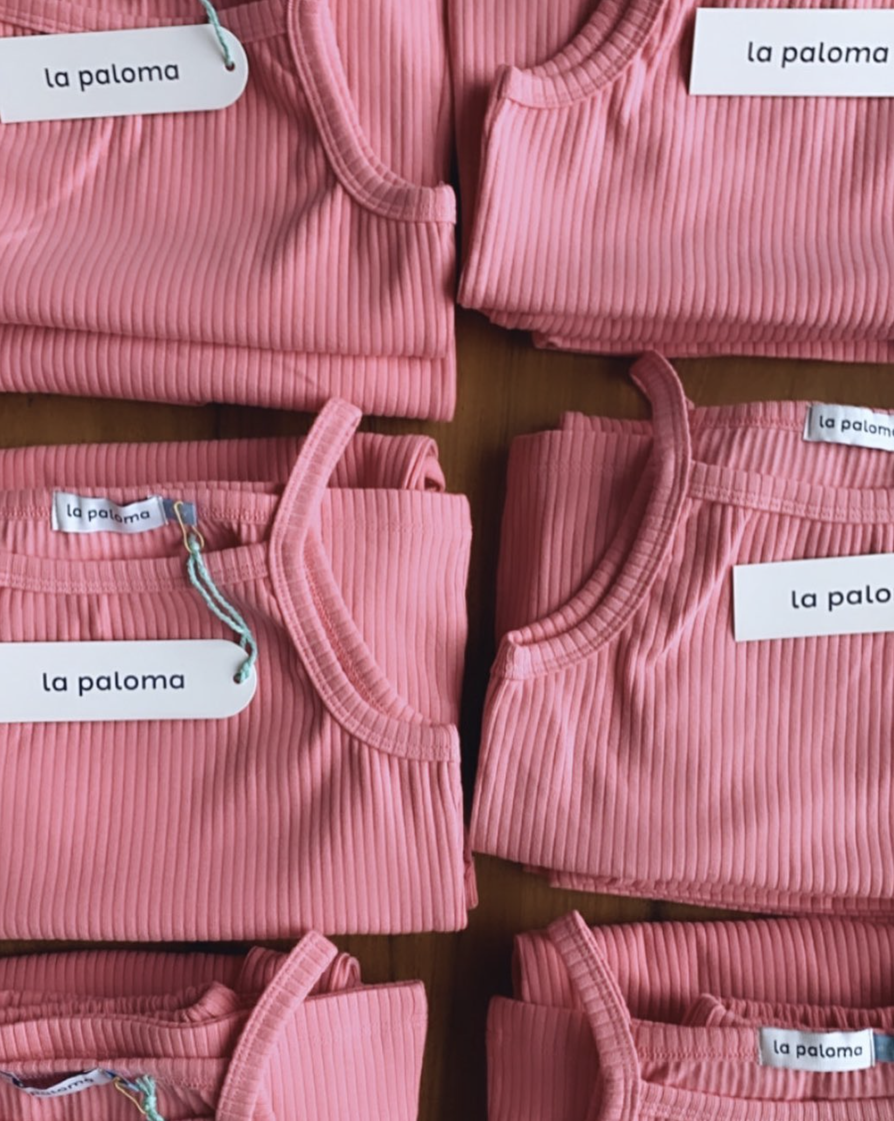
LA PALOMA
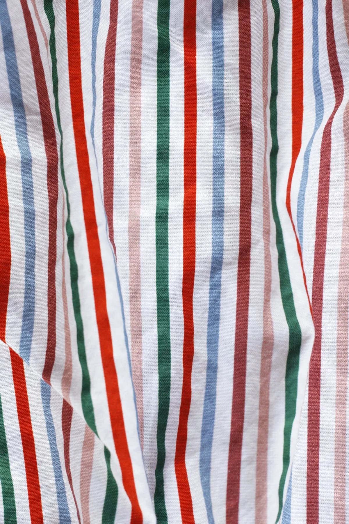
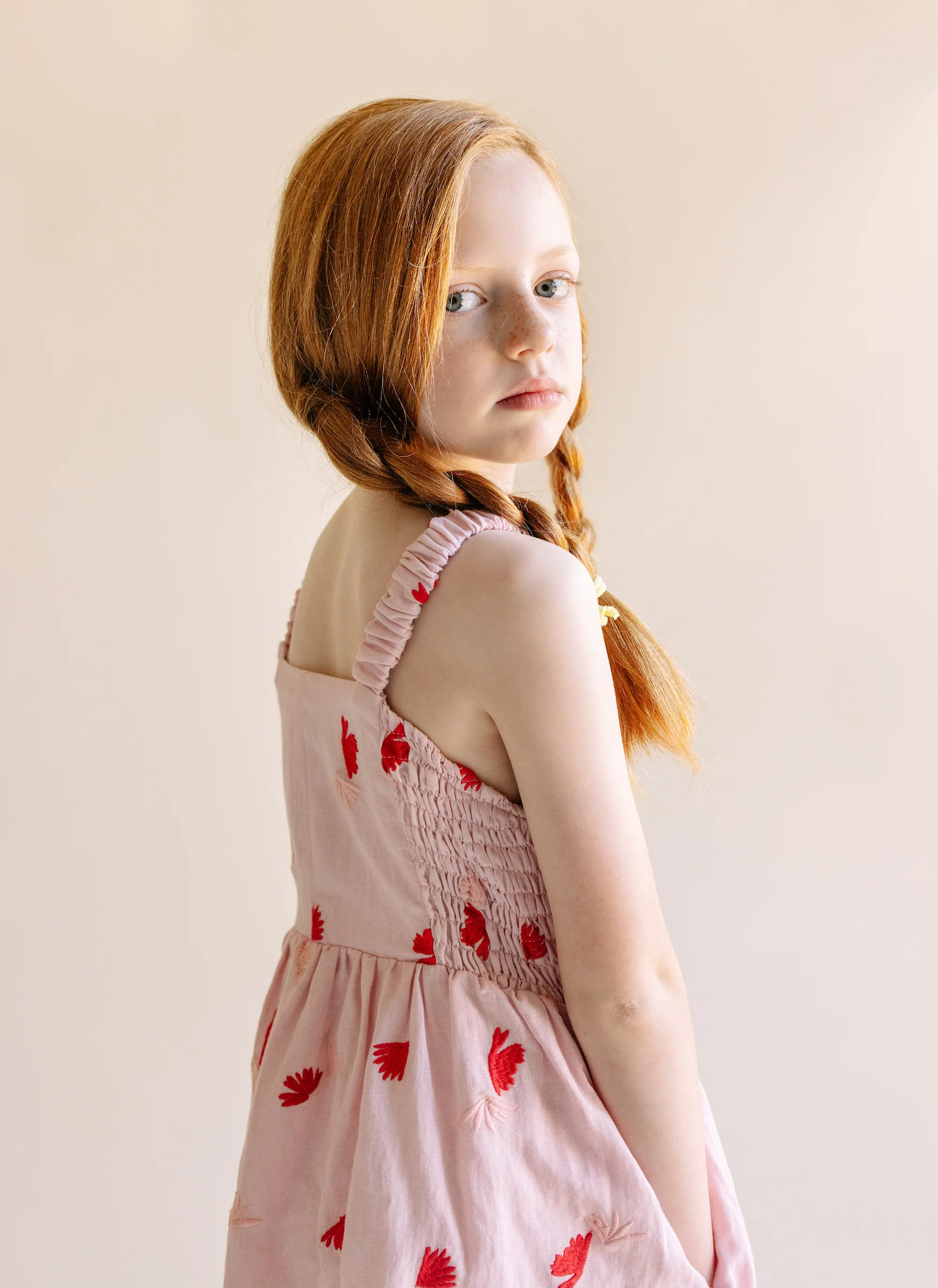
La Paloma is a line of sleep and loungewear created by Jen Pinkston, a mother and former stylist. It features artful pieces in gorgeous, natural fabrics meant for living and playing in. The brand is committed to sustainability, believing that wearing fewer, better clothes that are made to last can help reduce waste and keep our planet healthier for longer.
SERVICES
Brand Identity
Print Materials
CREDITS
Editorial photography:
shoplapaloma.com and @shoplapaloma.


Our goal in designing the logo and visual identity was to highlight its playfulness without suggesting that it was juvenile. Even though La Paloma began as a children's line, it's expanded to adults now too, so it was important that the brand could speak to all ages. We wanted to convey its sophistication, too, without it seeming stuffy. We achieved the right balance by leaning into neutral packaging with bright pops of color and a simple, approachable typographic system.


As a nod to the brand’s namesake, the dove (paloma in Italian), we developed a Picasso-inspired line drawing of the bird to serve as the logo. Paloma is also the name of Picasso’s daughter—we had fun with our research and love these thoughtful details that tie back to the brand’s origin story. The result is a brand identity that is steeped in art, joy, family, and a youthful vibrancy.
CLIENT TESTIMONIAL:
“Chelsea brings a true level of expertise in design to the table. From freehand illustrations to art references and amazing competency in font, scale, balance and beyond, Chelsea was an incredible wealth of knowledge. I knew without a doubt that I would end up with branding that not only reflected my vision for the brand but that was truly unique in the world as well.
The way she communicates throughout the process is clear and easy to understand. Sometimes it feels hard as someone who isn’t a designer to articulate aesthetic ideas that are in my mind, but she not only grasped my vision, but exceeded it in every possible way.”
—Jen Pinkston


