SOUTH TEXAS BRICK & STONE
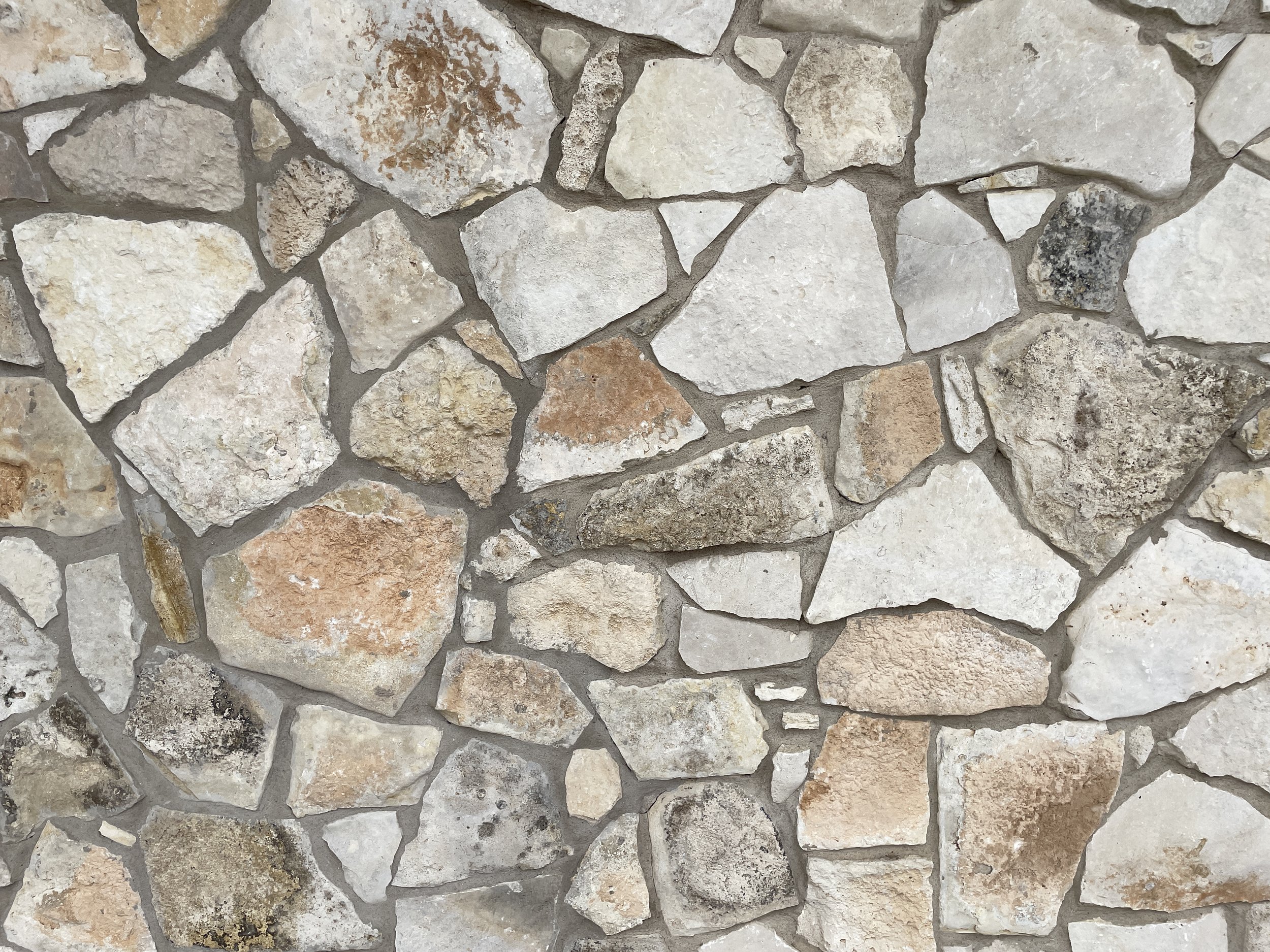
You don’t typically see a business like this one with a solid visual identity, so I was excited to work with South Texas Brick & Stone on a rebrand. STB&S, which has been family-owned and operated since 2008, sources reclaimed and manufactured brick and stone for architects, builders, designers, and homeowners throughout Texas.
SERVICES
Creative Direction
Brand Identity
Print Materials
Web Design
CREDITS
Printing: Jot Press


The part owners, Carlos and Elise Detering, wanted the brand to feel more high-end, aligning with taste preferences of the interior designers and architects they cater to, while still feeling approachable enough to appeal to the mason workers and builders who also make up a large part of their clientele. Since the business has so many types of customers, the visual identity needed to speak to everyone.


With all of that in mind, we outlined a few goals and figured out how to meet them in our rebrand:
– Using type styles that felt friendly with a touch of nostalgia, while still feeling clean and professional.
– Creating a look that spoke to every industry STB&S works with—blue collar, white collar, and everyone in between.
– A line of STB&S gear inspired by the company’s long history in Houston (the Detering family got their start as broom purveyors in 1871 before transitioning to brick in 1926).
– Branding that felt timeless and classic, but not stuffy, trendy or cute.

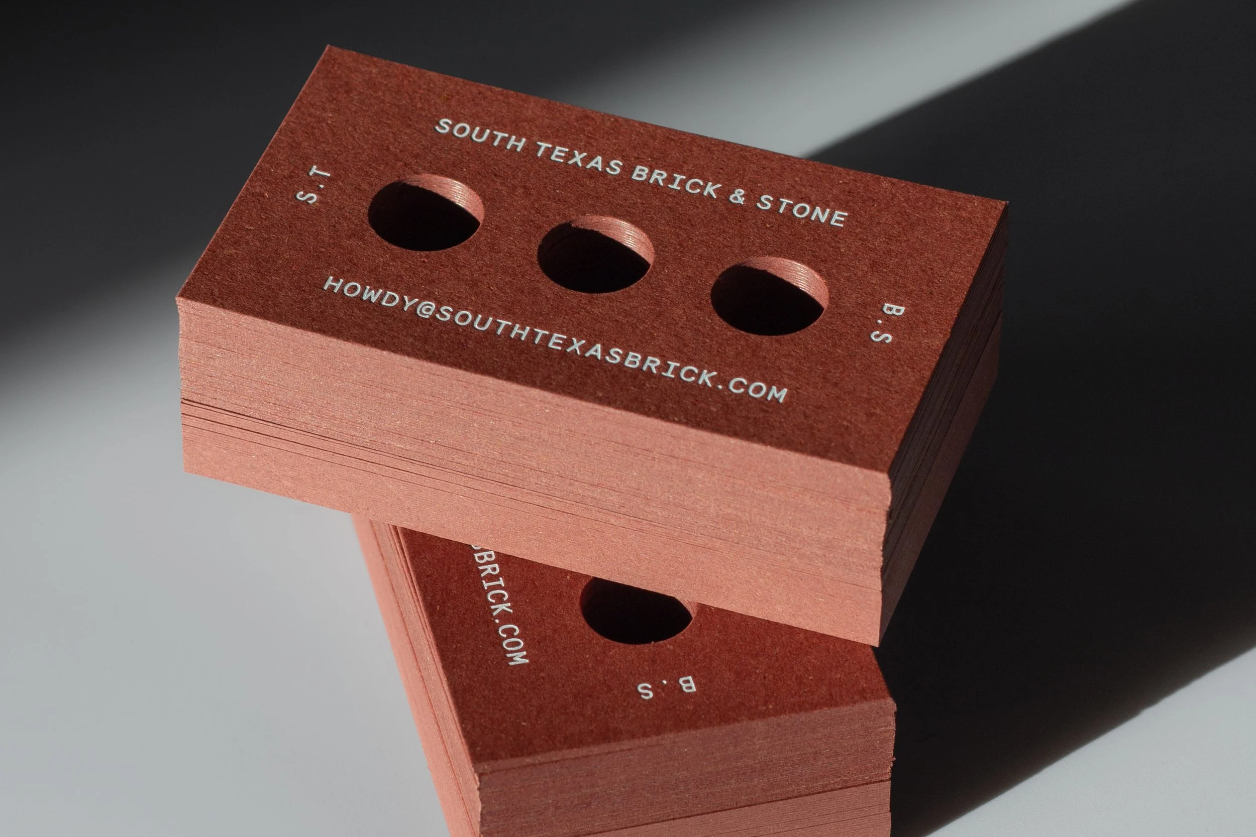
I thoroughly enjoyed researching and learning all about brick and stone for this project, and this led me to the standout piece in our rebrand: the brick business card. The more I looked at bricks, the more I was able to recognize that the proportions of our business cards were identical—we just needed to add holes. The extremely simple idea for this card popped into my head at 4am one morning and I went straight to the computer to design them right then. The card is made of recycled paper by Gmund Bier, a line that uses actual brewer’s spent grain in the paper, so it has these beautiful flecks in it just like actual bricks.

STB&S wanted to incorporate their original logomark and some of the original brand colors into the rebrand. We softened the edges of the mark to add some character, and so that it would work with the new logotype. We also toned down the color palette, shifting their bright red to a more muted brick red, and their indigo blue to a modern gray/blue. These subtle changes achieved our goal of preserving that element of nostalgia to the brand while adding much more sophistication. Along with the refreshed visual identity, we added a line of gear inspired by vintage merchandise: the Detering pen and a bold, type-heavy t-shirt.