

AVERY COX DESIGN
Avery and I worked together on her first brand 8 years ago. Close to a decade later, she’s evolved her interior design approach into one with more sophistication and a growing team, so she needed a new look to reflect that.
SERVICES
Brand Identity
Print Design
Web Design
CREDITS
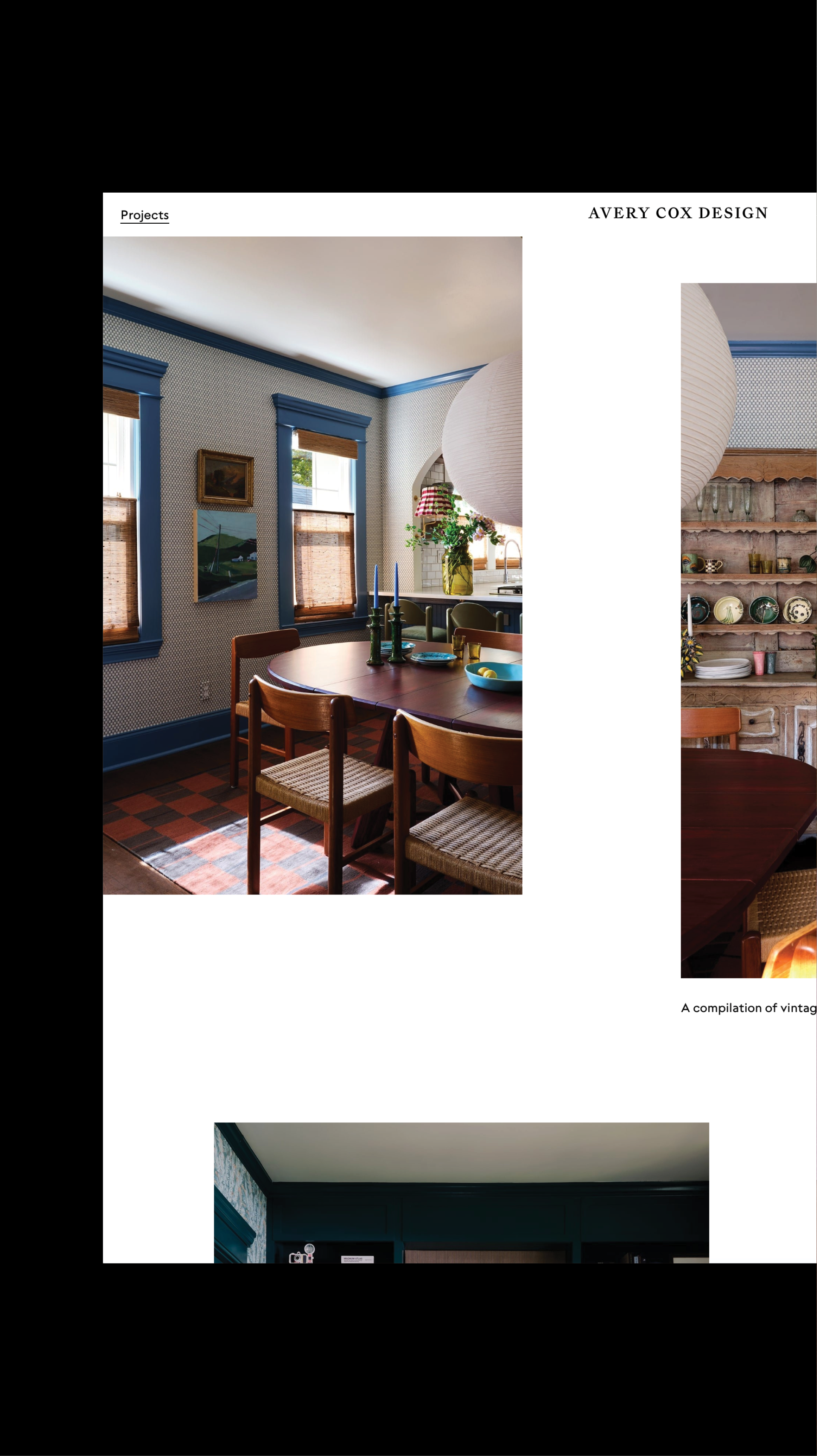
Interior photographs: Ngoc Minh Ngo, Lindsay Brown
Paper Supplier: Clampitt Paper
Letterpress Printer: Sargent Brothers


We sat down and took inventory of the ways she has outgrown her current brand identity, and narrowed our focus on four elements:
— Luxe printing processes and luxe paper, archiving the rubber stamps she had been using.
— A tonal, fresh palette that Avery has always and will always use in her designs.
— Timeless type styles and layouts, inspired by vintage stationery and packaging.
— Consistency—strict brand guidelines applied to all digital and print materials.


We integrated a lot of color and texture into Avery’s visual identity, print materials, and stationery system—touches like translucent parchment paper, letterpress embossing, screen printed tone-on-tone business cards, and recycled electric pink paper to perfectly capture her vibrant, colorful interiors.


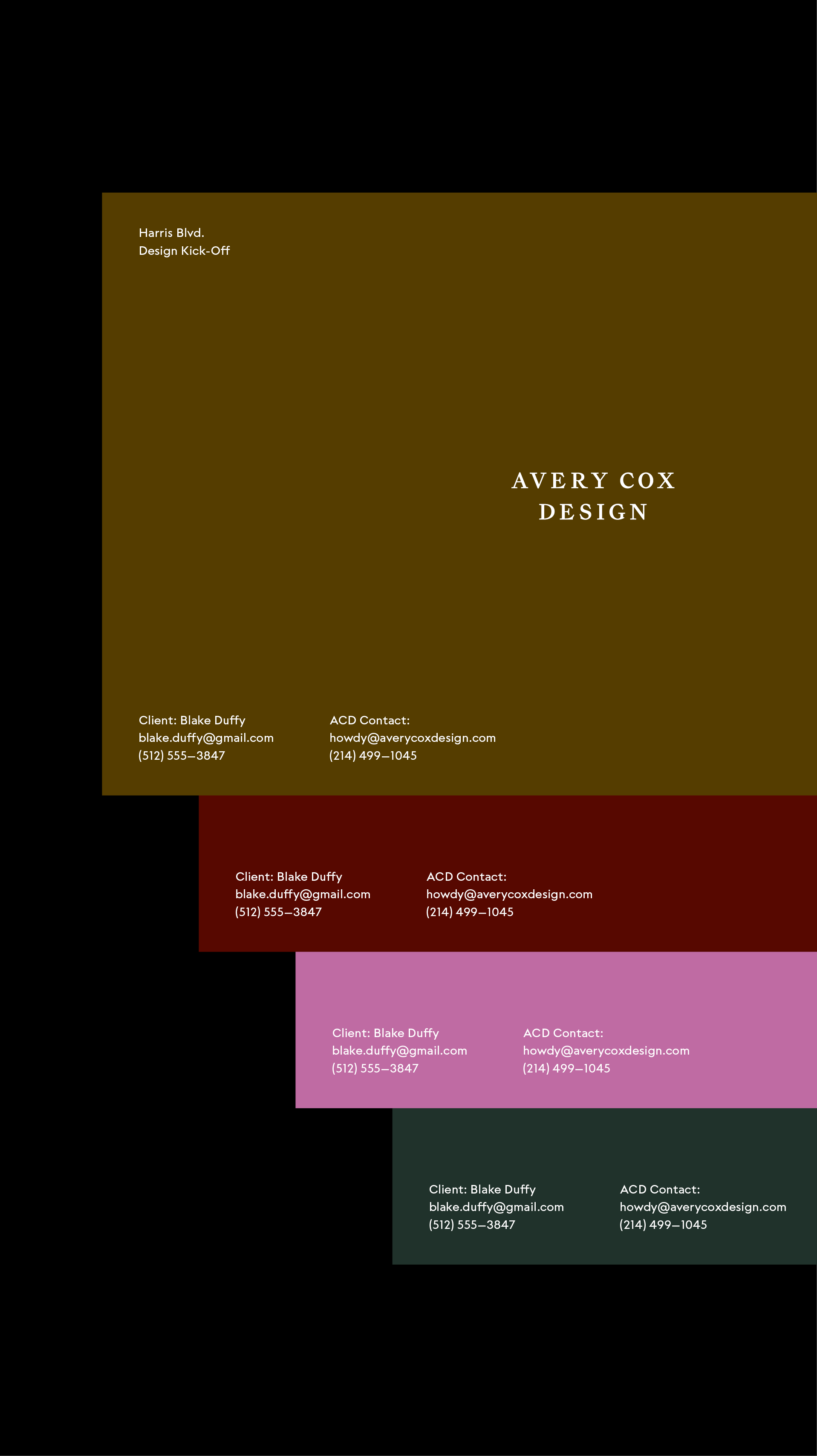
We came up with a core color palette for her brand, weaving in that electric pink, a deep ochre yellow, warm oxblood red, and a tranquil dark teal. Then we redesigned her portfolio website to feature big imagery with delightful touches like images with motion, adding footers and pages in her new core colors (which pair beautifully with her work).


One detail that I was especially excited about creating with Avery were her hand painted cards. Together, Avery and I hand painted large pieces of cardstock, which we then had cut down, so she has a set of stationery that is like a little one-of-a-kind painting for her clients.